
BHF / Visual Identity
MY ROLE / CONCEPT / ART DIRECTION / GRAPHIC DESIGN / CREATIVE DIRECTION
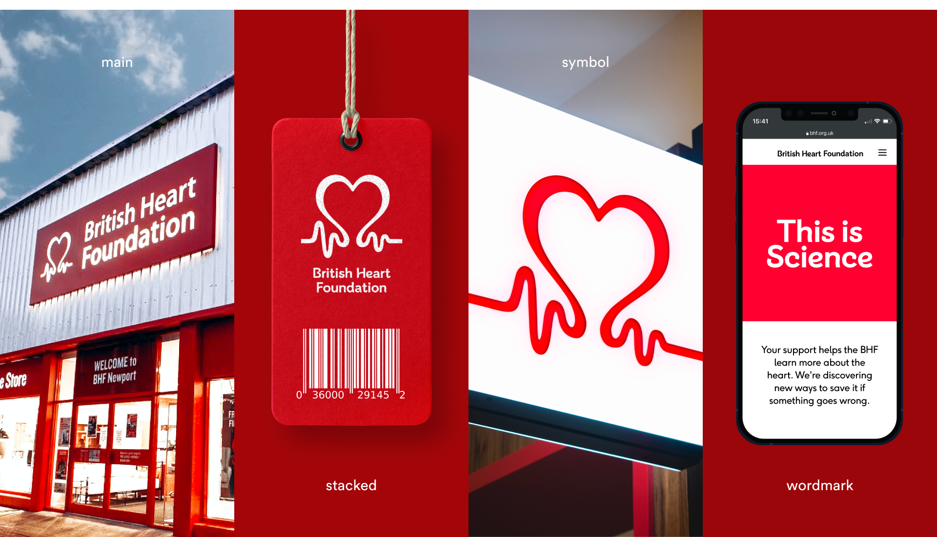
I led the transformation of the British Heart Foundation’s brand to address a lack of consistency and cohesion across platforms. The organisation’s visual identity and tone varied significantly between physical stores, campaigns and digital channels, creating a disjointed experience for audiences.
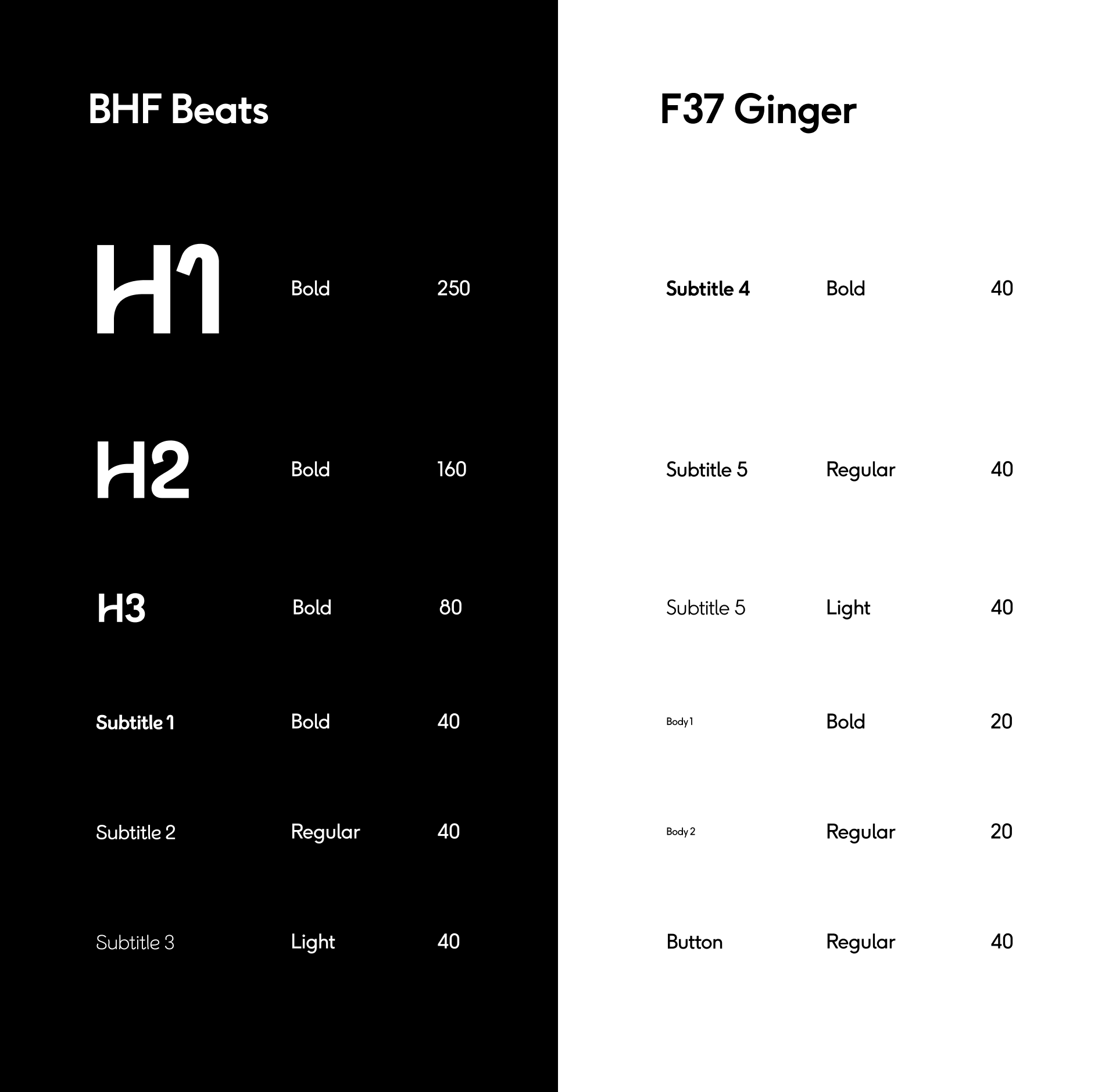
I directed the development of a unified brand framework, including a cohesive visual language, refined tone of voice and flexible design system. Every element—from typography and colour palettes to campaign storytelling—was crafted to build credibility, evoke emotion and connect every interaction back to the organisation’s driving force: lifesaving scientific research and the irreplaceable value of the heart.
The new brand framework established clear “brand furniture” that ensures consistency while allowing flexibility for future growth. It has strengthened the British Heart Foundation’s position as a trusted, inspiring organisation and embedded a greater sense of urgency and purpose across all communications.


At the core of this transformation was the idea that every aspect of the brand should always link back to its driving force—scientific research—and reinforce the precious nature of the heart.

Before
AfTER